My Courses
Reimagining how 19,000+ RIT students manage their academic workload,
an AI-assisted, node-based redesign of MyCourses, taken from a tested Figma concept to a working,
trust-tested product.


My Courses
Reimagining how 19,000+ RIT students manage their academic workload,
an AI-assisted, node-based redesign of MyCourses, taken from a tested Figma concept to a working,
trust-tested product.


AT A Glance

I redesigned MyCourses around one idea, then built it twice - once to prove students wanted it, once to prove they could trust it.

01

24 students, two rounds

95% felt anxious managing overlapping deadlines; 86% wanted AI-assisted task breakdown. That told me the concept was right.

02

Decision that mattered the most

V1 tested at 90% preference, but the node interaction was hard to parse and every "smart" moment was simulated. I chose to rebuild the interaction layer in working code.

03

What Shipped - AI That Works

A working AI Task Generator that explains its reasoning before you see its plan, and lets you edit or reject it - not just accept it.

Overview

MyCourses is RIT's learning management system - used daily by 19,000+ students. It presents everything at once and asks students to figure out the rest.

This redesign asks : What if the platform did some of that thinking for you?

Role

UX Designer and Researcher

Tools

Figma, Replit, Google Gemini, Claude

Team

Solo

Timeline

08 Weeks

Research

24

Students surveyed across two rounds of research

↑4 departments at RIT

86%

Wanted AI-assisted step-by-step task breakdown

↑Validating the core concept

90%

Preferred the proposed direction over existing MyCourses

↑After concept validation round

Research

Round 1 - Understanding the problem

Every student I spoke to described the same feeling - five tabs open, three course pages loaded, no idea where to start.

felt anxious or avoidant when multiple deadlines were approaching

95%

were manually breaking down assignments - work the platform should be doing

86%

missed or nearly missed a deadline due to lack of reminders

56%

Key Findings ↓

(01) Project Planning

Students needed suggested timelines, structured task breakdowns, and time estimates for each project phase.

(02) Resource Support

Access to relevant resources and example outlines was considered highly valuable for understanding requirements.

(03) Centralized Clarity

A single dashboard consolidating deadlines, clear rubrics, and submission expectations was a clear priority.

(04) Direct Communication

Tools for direct contact with professors and classmates, alongside deadline reminders, would reduce workload stress.

Not what should it look like - but what does a student need to do next?

Where it falls short

Every RIT student I spoke to described the same feeling - five tabs open, three course pages loaded, no idea where to start.

MyCourses desktop app - a grid of all enrolled courses, announcements and upcoming deadlines.

Everything is equal. There's no signal for what needs attention today.

Course content page — announcements, links, and resources in a single column.

No next action. Students open this page and still don't know what to do.

PROCESS

Five directions. Each one taught me something the last one couldn't.

01

A strong start. Stats, tasks, courses in one place - the foundation was forming.

02

Pushed the AI angle early. Kept the learning plan idea, refined the framing.

03

Different ways of presenting the same information.

04— THIS IS IT

More clarity on the user flow. Everything clicks. Nodes, deadlines, feedback, AI - all in one place. This is it.

05

What's Next becomes the hero. Drag and drop, AI panel, real momentum. Needed more visual direction.

"The student decides the action, the platform handles the connection."

PROCESS

Five directions. Each one taught me something the last one couldn't.

01

A strong start. Stats, tasks, courses in one place - the foundation was forming.

02

Pushed the AI angle early. Kept the learning plan idea, refined the framing.

03

Different ways of presenting the same information.

04— THIS IS IT

More clarity on the user flow. Everything clicks. Nodes, deadlines, feedback, AI - all in one place. This is it.

05

What's Next becomes the hero. Drag and drop, AI panel, real momentum. Needed more visual direction.

"The student decides the action, the platform handles the connection."

Why node, not a list

The redesign is built around one idea - the student decides the action, the platform handles the connection, then built it twice. Once to prove students wanted it, once to prove they could trust it.

01

Visual Decomposition

Every key element - Assignment, Resource, AI Coach, Peer - is visualized as an actionable node, replacing overwhelming data lists with discrete units of action.

02

Relational Logic

Relational mapping means the system instantly filters and displays only the items related to the current task.

03

System Integrity

The Node Map is the central view - planning, collaboration, and submission all happen within the same visual boundary.

Three Shifts, Each one a real trade off


Three Shifts, Each one a real trade off


Three Shifts, Each one a real trade off


Three Shifts, Each one a real trade off


AI Trust: Blind → Earned
The AI Task Generator explains itself, refuses to guess, and takes direction
Shows its reasoning before a plan, and lets a student reject, edit, or revise it by prompt.
Node Icons: Confusing → Clear
Take a guided tour
A guided Dashboard Tour names the three action icons directly.
Product States: Simulated → Real
Every state is now live, not implied
Upload progress, AI "thinking," and status all propagate live.

The Product


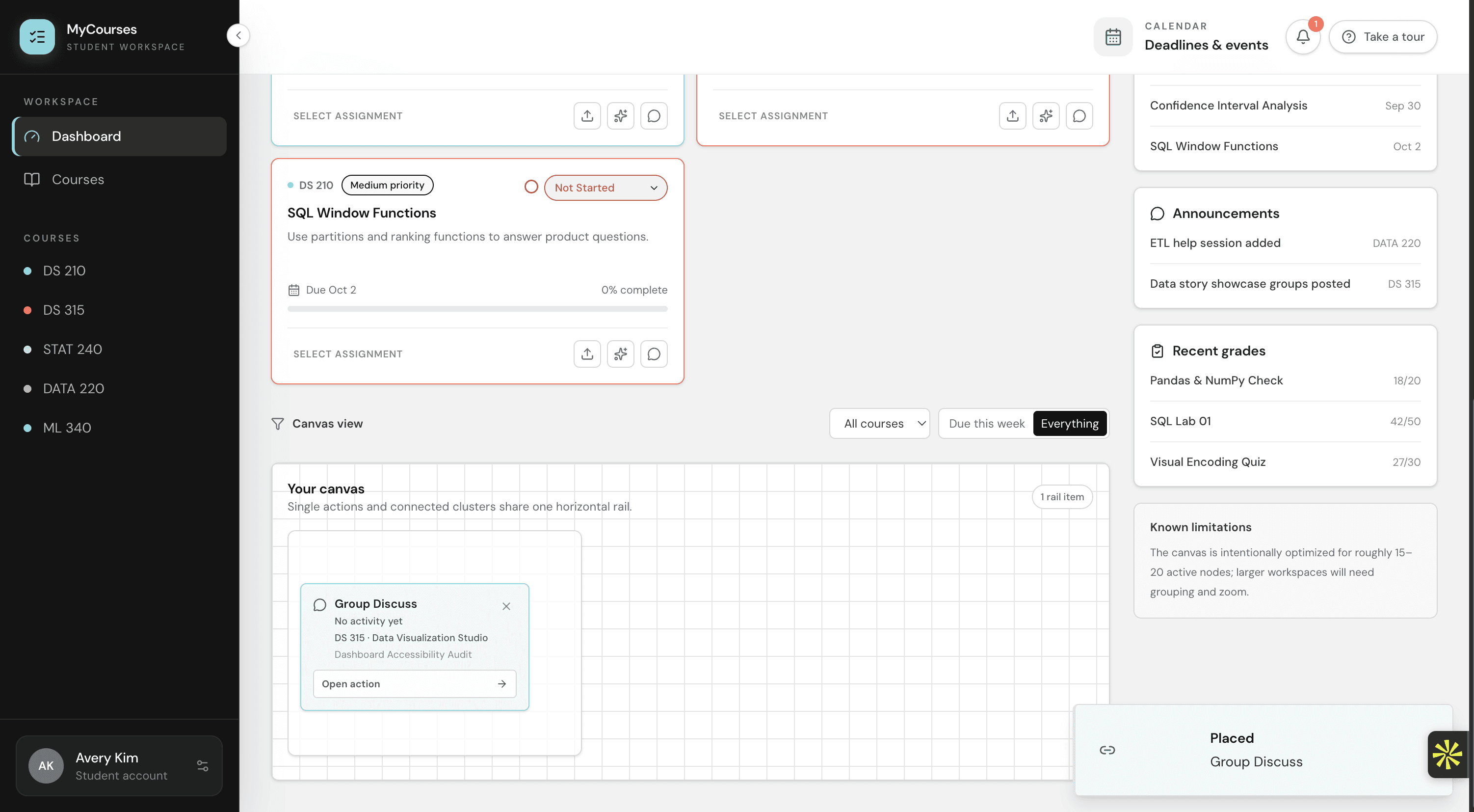
Every assignment card carries the same three actions - which one a student reaches for depends on what the assignment needs next.

01
Submit Files
Attaches a file to an assignment and marks it submitted - real upload progress, then a status change that updates the card, the course page, and the canvas together.
02
AI Task Generator
Turns an assignment into a step-by-step plan, with the reasoning note and Reject / Edit controls covered in detail two sections back.
03
Group Discuss
Starts a focused thread tied to the assignment. 'Ready to discuss,' a prompt for what the group should cover, then 'Start discussion.' The simplest of the three nodes, and it stayed simple.
01
Submit Files
Attaches a file to an assignment and marks it submitted - real upload progress, then a status change that updates the card, the course page, and the canvas together.
02
AI Task Generator
Turns an assignment into a step-by-step plan, with the reasoning note and Reject / Edit controls covered in detail two sections back.
03
Group Discuss
Starts a focused thread tied to the assignment. 'Ready to discuss,' a prompt for what the group should cover, then 'Start discussion.' The simplest of the three nodes, and it stayed simple.

Outcome

0%

of students preferred the AI task breakdown, collaboration features, and the ability to choose their own action - when tested against the existing MyCourses.

The node connection flow was slower to parse than the rest of the experience - the one piece that needs to feel snappier.